Modular Type by Vanessa Zúñiga Tinizaray →
A designer from Ecuador specialized in experimental type, pattern fonts and typography in motion.
Legendary German designer Erik Spiekermann discusses the importance of typography and offers sage advice for anyone getting started.
Creativity, Explained is an animated series from Adobe that explores the fundamental principles of art and design. Part education, part inspiration, each segment is voiced by a luminary in the field and provides highly relevant advice for hobbyists and working creatives alike.
The aim was to create and guide the use of graphics for a show that hosts a wide spectrum of personalities with diverse areas of expertise. During the complete development, our focus was set on pushing the limits of the graphics and animations for visuals that would feel diverse and versatile, able to represent the processes and evolution of human ideas with a fresh and fun approach.
Creative coder who hails from Hamburg
Microsoft approached us to create an alternative typographic take on their Fluent UI logotype which uses their brand typeface Segoe. The idea was that our more expressive version would transform to become Segoe in its rested state. We built and modelled type that took the proportions of Segoe and elevated it, making it technical, physical and transformative. This served as the opener for an animated film introducing Fluent UI at the Microsoft Build 2020 conference.
Fluent UI is a collection of UX frameworks — a cross-platform, open-source approach that enables people to contribute and improve on the design-to-code system.
Incredible 3D illustrations by this studio
Stunning works and creative ideas from Rio de Janeiro based graphic designer.
Mónika Rudics is a graphic designer from Budapest who created this stunningly playful typography book.
A great graphic and 3D designer from Rio who amongst many of his projects, created one specific one that stood out for me for being both a beautiful and innovative approach to the popular 36 Days of Type event. You can find more of his work here.
The National Art Center, Tokyo has celebrated its 10th Anniversary in January.
The installation "Forest of Numbers" visualized the decade of the future from 2017 to 2026, created a sense of stillness across the large exhibition space. More than 60,000 pieces of suspended numeral figures from 0 to 9 were regularly aligned in three dimensional grids. A section was removed, created a path that cut through the installation, invited visitors to wonder inside the colorful forest filled with numbers.
The installation was composed of 10 layers which is the representation of 10 years time. Each layer employed 4 digits to express the relevant year such as 2, 0, 1, and 7 for 2017, which were randomly positioned on the grids. As part of Emmanuelle’s "100 colors" installation series, the layers of time were colored in 100 shades of colors, created a colorful time travel through the forest.
Skatepark font as the name suggest is a typography but also motion design project shared by Keisuke Terashima. A graphic designer, motion designer and art director at PARTY in Tokyo, Japan.
Scandinavian design agency Kontrapunkt joined forces with Bruce Mau Design in Toronto to expand Asics' five-letter logotype into a complete bespoke typography that empowers the ASICS Tiger brand.
One of my favourite design studios to flourish over the last few years is the London based Sawdust studio created by Jonathan Quainton and Rob Gonzalez. They specialise in bespoke and innovative typography, brand display typefaces, visual identities and image-creation for clients such as Nike, Wired and The New York Times.
At the heart of what they do is a desire to create work that is both explorative and beautifully crafted. Above all else we retain a deeply rooted conviction to not only deliver design that is effective but that exceeds our client’s expectations.
3D designer and illustrator Rizon Parein has managed to take his talent and passion for graffiti from the streets of Belgium to the forefront of the world of design and advertising. His unique 3D style is colorful and playful, and his digital models come beautifully close to reality.
Martin Sati is an illustrator and designer based in Seville, Spain.
He opened his studio in 2006, focusing on art direction and illustration.
Dimitris Papazoglou, a talented multidisciplinary Designer and Creative Director from Greece, His work is beautifully crafted & with a great sense of art direction and attention to detail.
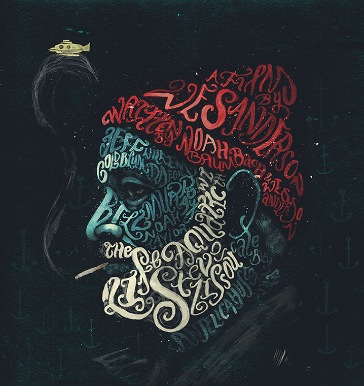
Peter Strain is an AOI Award winning Illustrator working and living in Belfast. His work is inspired by film and music as well as social, political and cultural issues. He tackles these with a highly distinctive hand lettering style, bold imagery and humour.
Dana Tanamachi is a lettering artist and designer who enjoys living a quiet life and working with her hands. In 2009, an impromptu chalk installation for a Brooklyn housewarming party landed Dana her first commission for Google and set the popular chalk-lettering trend—and her career—in motion.
The new typeface by Fontsmith. Designed by Jason Smith, FS Untitled is based the iconic typeface for Channel 4’s rebrand in 2005: the classic, quirky, edgy C4 headline font. In celebration of the launch, FS also created a digital playground in collaboration with The Space Between to help people explore the typeface.